After a decade of using my branding made in GIMP, I decided to finally redesign it with proper layers, scalability, and aesthetics.
Older design took inspiration from BMW M Series logos with the three slanted lines appended to the "M". My usual online moniker is "Niven5111", so I wanted to a play on roman numerals and tie that in with the logo.
Some design iterations. Initially started with an all-flat design, then adding drop shadows for a "felt" like texture. I wanted to stick with a flat design, but the letters weren't standing out as much as I wanted, so I added a cutout border. Tested with how a cutout in the dot of the eye looks, then expanded to the other letters.
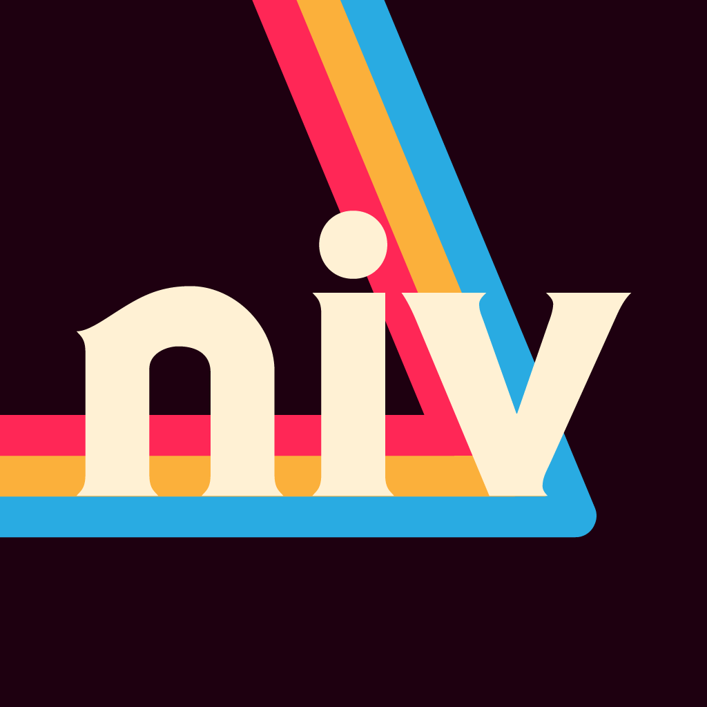
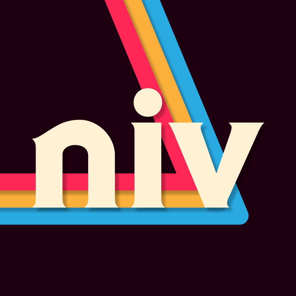
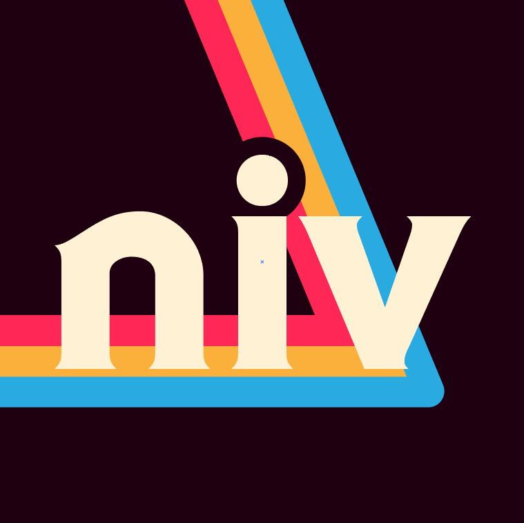
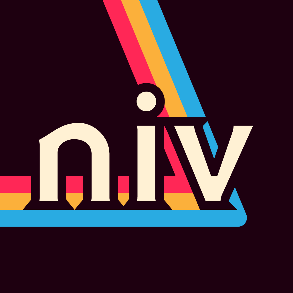
I opted to making my own letter cutout, to fulfill more of the curves I wanted.
Finally, I landed on a better color scheme. I also opted to end the ribbons with rounded corners in this transparent version, and made the border cutout simpler.
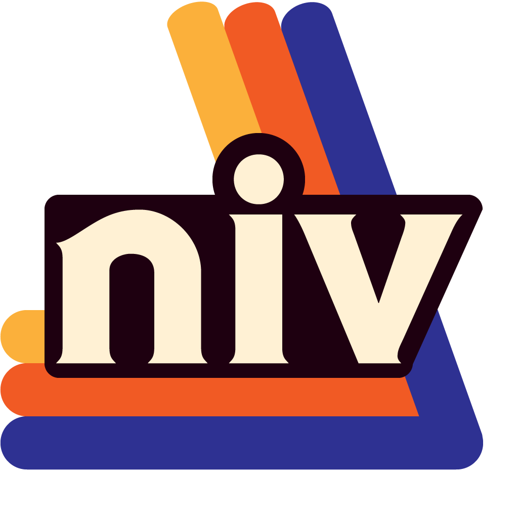
Finalized logo and its different variants.
